
前提
我相信开发Android的同学们应该对Material Design设计非常熟悉了吧,它是Google在Android 5.0后推出的全新设计语言,我个人是非常喜欢Material Design的设计的,整个交互非常轻量、舒服,提高了用户在交互上的效率和愉悦感,操作起来不会有疲劳感。本篇文章主要是收集一些material design的控件及相应的用法,并加以示例说明,让大家学会使用这些控件,并当控件应用于实际项目中,提高用户的交互体验。我会在以后的日子里发现新的material design控件后,不断更新此文章。在项目使用material design控件前,需要先导入support:design项目依赖包。如:compile 'com.android.support:design:23.4.0'
1.Snackbar
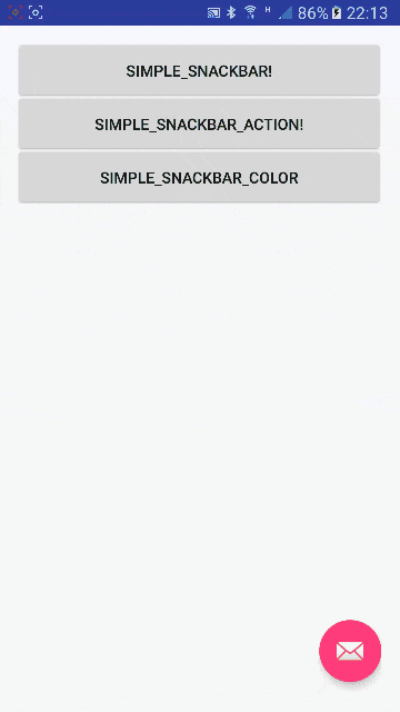
Snackbar提供了对操作轻量级的反馈,它在屏幕的下方展示短暂消息提示。它出现在屏幕的最上方,也就是所有控件的上方(除dialog,popupWindow外),而且同一时间只能显示一个Snackbar.
它的功能类似于Toast,不同的是,snackbar可以放按钮,通过按钮来进行交互。Snackbar同时还支持滑动消失,就像通知栏一样。
1.1 Snackbar使用规则
1. 简短的文字信息
作为提示信息时,Snackbar最好只包含一行文字,而且不可以包含图标。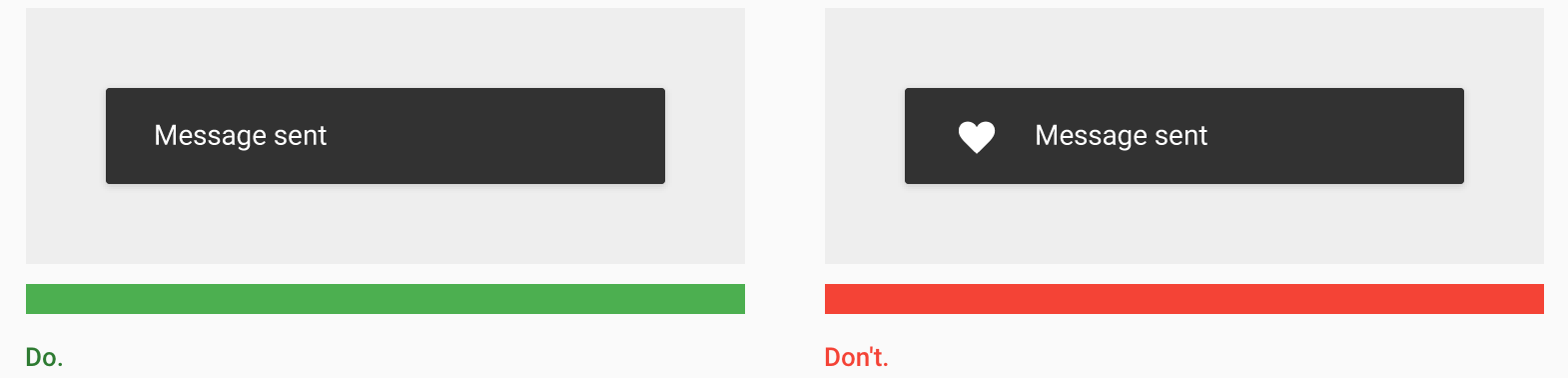
2. 短暂的显示Snackbar在设置的时间后会自动消失,它不应该被设置显示时间过长,如果需要通过Snackbar进行其它操作时,最好不要把Snackbar作为唯一的入口,同时它显示在所有其它控件的上方(除了dialog和popupwindow)。
3. 0-1个ActionSnackbar只能包含一个Action,两个或者以上的需要使用Dialog来实现。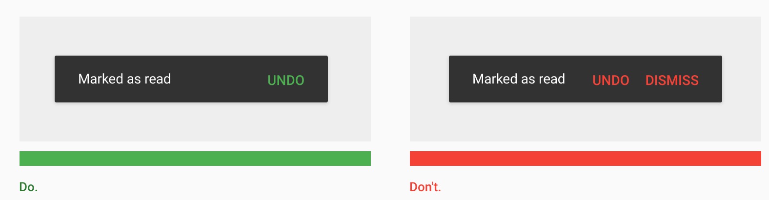
Snackbar.make(mRootLayout, "提示信息", Snackbar.LENGTH_LONG)
                .setAction("UNDO", v1 -> {
                      //TODO
                })
                .show();
4.不要挡住floating action button
这里所说的就是在使用floating action button时,如果项目里要使用Snackbar时,需要让floating action button使用CoordinatorLayout来作为根布局。
1.2 改变文字的显示颜色
Snackbar可以改变两个部分文字的颜色,一个是正常提示文字的颜色,还有一个是ActionText文字的颜色。我们通过代码来给大家展示一下。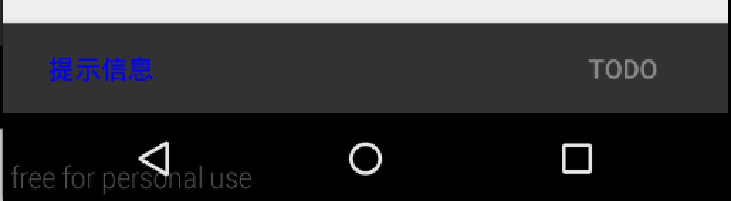
mSnackbarColor.setOnClickListener(o -> {
            Snackbar snackbar = Snackbar.make(mRootLayout, "提示信息", Snackbar.LENGTH_SHORT)
                    .setAction("TODO", O1 -> {
                        Toast.makeText(this, "我是一个toast", Toast.LENGTH_SHORT).show();
                    });
            snackbar.setActionTextColor(Color.GRAY);
            View view = snackbar.getView();
            TextView textView = (TextView) view.findViewById(android.support.design.R.id.snackbar_text);
            textView.setTextColor(Color.BLUE);
            snackbar.show();
        });
Snackbar例子完整源码地址
https://github.com/allen218/MaterialDesignExamples/tree/master/TestSnackbar
2. TextInputLayout
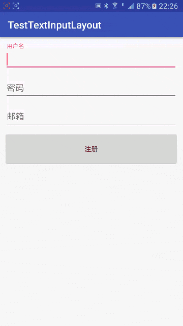
一个包裹EditText的ViewGroup,可以将EditText里的hint属性值当作一个标签动态的显示到EditText的左上角。用动画的形式来完成相应的交互,体验好。我们还可以为TextInputLayout设置错误信息,如果输入不符合条件,让其在EditText显示该错误信息。一般情况下,每个TextInputLayout包含一个EditText,多个EditText需要多个TextInputLayout进行包裹。
TextInputLayout使用的布局基本格式如下
<android.support.design.widget.TextInputLayout
      android:id="@+id/email_input_layout"
      android:layout_width="match_parent"
      android:layout_height="wrap_content"
      android:layout_below="@+id/pass_input_layout"
      android:layout_marginLeft="10dp"
      android:layout_marginRight="10dp">

      <EditText
          android:layout_width="match_parent"
          android:layout_height="wrap_content"
          android:hint="@string/email" />
  </android.support.design.widget.TextInputLayout>
这里我们使用TextInputLayout来包裹EditText,然后给EditText设置hint属性值就可以完成hint值变标题栏的动画了。如果还需要添加错误信息提示的话,这时,我们还需要在代码里通过setError()或者setErrorEnabled()来进行错误信息的显示与隐藏的。
/**
 * 验证用户名是否合法
 *
 * @return
 */
private boolean validateUsername() {
    if (TextUtils.isEmpty(mUsername.getText().toString().trim())) {
         mUsernameLayout.setError(getString(R.string.username_not_null));
        mUsername.requestFocus();
    } else {
            mUsernameLayout.setErrorEnabled(false);
    }
    return true;
}
这里当用户名不符合条件时,使用setError()来设置错误提示信息,当用户名符合要求时,使用setErrorEnabled()来收起错误提示信息。这里还有一个小细节,就是当提示错误信息后,需要让当前EditText获取焦点,让用户不用再手动多点击一次输入框,而直接进行输入。
TestInputLayout完整源码地址
https://github.com/allen218/MaterialDesignExamples/tree/master/TestTextInputLayout
3.TabLayout
TabLayout是一个非常好用的通过配合Viewpager来实现Tab切换的官方原生实现。在5.0之前,我们通常实现这种效果需要依赖第三方的库。它支持两种滑动切换方式。一种是:Fixed,也就是所有的Tab都在当前屏幕中显示,每个Tab平均分配宽度。这种实现方式在当Tab比较多,一屏显示不下的情况下,每个Tab只能显示一丁点的空间,也就是不能完全显示,体验差。而另外一种实现是:Scrollable,在一屏能完全显示的情况下,和Fixed是一样的效果,但当一屏显示不下时,它的策略是只显示部分的Tab,通过滑动来显示其它没有显示的Tab。而且如果两边都有Tab没有显示时,它会始终停止在中间位置。
我们来看一下TabLayout的在布局文件里的配置:
<android.support.design.widget.TabLayout xmlns:app="http://schemas.android.com/apk/res-auto"
    android:id="@+id/tab"
    android:layout_width="match_parent"
    android:layout_height="wrap_content"
    app:tabMode="scrollable">
</android.support.design.widget.TabLayout>
3.1 Fixed TabLayout
这个是通过app:tabMode="fixed"来进行设置的,当然这是默认的配置,也就是不配置也可以实现。
3.2 设置TabLayout居中显示
 这里我们需要通过
app:tabGravity="center"来进行设置,才会有上面的效果,使用app:tabGravity="fill"也就是铺满。
3.3 带图标文字的TabLayout实现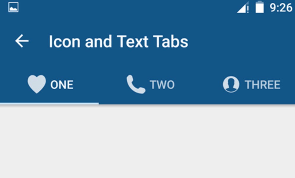 这里需要使用的核心代码是:
    /**
     * 给每个tab设置图标
     */
    private void setTabLayoutIcon() {
        mTabLayout.getTabAt(0).setIcon(R.drawable.a1);
        mTabLayout.getTabAt(1).setIcon(R.drawable.a2);
        mTabLayout.getTabAt(2).setIcon(R.drawable.a2);
}
这里有个问题就是默认的图标和文字不是显示在同一行,而是图标在上,文字在下,是这样子的。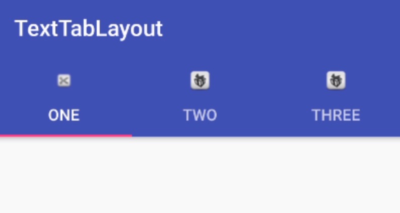
如果需要做成图片和文字在同一行,下面提供一种实现方式。首先先上tab的布局:
<?xml version="1.0" encoding="utf-8"?>
<RelativeLayout xmlns:android="http://schemas.android.com/apk/res/android"
    android:gravity="center"
    android:layout_width="match_parent"
    android:layout_height="match_parent">

    <ImageView
        android:id="@+id/icon"
        android:layout_width="20dp"
        android:layout_height="20dp"
        android:layout_centerVertical="true" />

    <TextView
        android:id="@+id/title"
        android:layout_width="wrap_content"
        android:layout_height="wrap_content"
        android:layout_centerVertical="true"
        android:layout_toRightOf="@+id/icon"
        android:text="标题" />

</RelativeLayout>
然后在Adapter里来增加获取tab中view的方法。
 /**
 * 处理文字带图标的tab显示
 *
 * @param position
 * @return
 */
public View getPagerView(int position) {
    View view = LayoutInflater.from(getApplicationContext()).inflate(R.layout.pager_title_image, null);
    ButterKnife.bind(this, view);

    mIcon.setImageDrawable(mDrawables.get(position));
    mTv.setText(mTitles.get(position));
    return view;
}
再通过下面方式把TabView设置到Tab上。
/**
 * 给每个tab设置图标
 */
private void setTabLayoutIcon() {
    for (int x = 0; x < mTabLayout.getTabCount(); x++) {
        TabLayout.Tab tab = mTabLayout.getTabAt(x);
        tab.setCustomView(adapter.getPagerView(x));
    }
}
实现后的效果如图: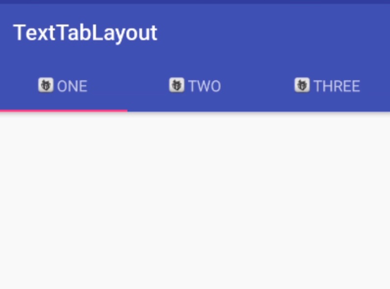
3.4 只带图标的TabLayout
在实现图标文字的基础上进行修改,也就是将Adapter里获取标题文字的方法注释:
   /* @Override
    public CharSequence getPageTitle(int position) {
        return mTitles.get(position);
    }
*/
然后,在设置TabLayout方法中通过设置每个Tab的Icon来完成设置。
    /**
 * 给每个tab设置图标
 */
private void setTabLayoutIcon() {
    /*for (int x = 0; x < mTabLayout.getTabCount(); x++) {
        TabLayout.Tab tab = mTabLayout.getTabAt(x);
        tab.setCustomView(adapter.getPagerView(x));
    }*/
    mTabLayout.getTabAt(0).setIcon(R.drawable.a1);
    mTabLayout.getTabAt(1).setIcon(R.drawable.a1);
    mTabLayout.getTabAt(2).setIcon(R.drawable.a2);
    mTabLayout.getTabAt(3).setIcon(R.drawable.a2);
    mTabLayout.getTabAt(4).setIcon(R.drawable.a2);
    mTabLayout.getTabAt(5).setIcon(R.drawable.a2);
    mTabLayout.getTabAt(6).setIcon(R.drawable.a2);
    mTabLayout.getTabAt(7).setIcon(R.drawable.a2);
    mTabLayout.getTabAt(8).setIcon(R.drawable.a2);
}
这样就完成了一个只有图标的TabLayout的显示。
TabLayout完整源码例子
https://github.com/allen218/MaterialDesignExamples/tree/master/TextTabLayout
4.Floating Action Button
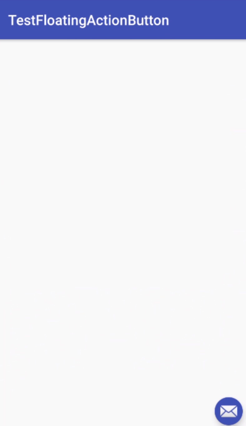
Floating Action Button是一个悬浮的操作按钮,可以当作一个快捷导航来使用,或者是一些最常用的功能可以通过此按钮来进行展示。它一般悬浮在窗口的最上层且一般设置在右下角的位置方便操作。Floating Action Button在布局中的设置如下:
<android.support.design.widget.FloatingActionButton xmlns:app="http://schemas.android.com/apk/res-auto"
    android:layout_width="wrap_content"
    android:layout_height="wrap_content"
    android:layout_gravity="bottom|right"
    android:layout_marginBottom="10dp"
    android:layout_marginRight="10dp"
    android:src="@android:drawable/ic_dialog_email"
    app:fabSize="mini" />
这里我们需要使用两个属性:
- layout_gravity:通过这个属性将
floating action button设置到相应的位置,上面代码我们设置的是右下角。- app:fabSize:这个是设置图标的大小,默认为正常大小,还有一个属性值是
mini,也就是小一号。- app:backgroundTint:改变图标背景的颜色。
Floating Action Button完整源码地址
https://github.com/allen218/MaterialDesignExamples/tree/master/TestFloatingActionButton
5.NavigationView
NavigationView是Android左滑菜单内部实现,这里面分为两部分,一部分是头部,通过app:headerLayout在布局文件来进行添加,另一部分就是菜单列表,通过app:menu在布局文件里进行设置。
这里我们先来看看头部的xml布局:
<?xml version="1.0" encoding="utf-8"?>
<RelativeLayout xmlns:android="http://schemas.android.com/apk/res/android"
    android:layout_width="match_parent"
    android:layout_height="192dp"
    android:background="@drawable/a4"
    android:orientation="vertical">

<de.hdodenhof.circleimageview.CircleImageView xmlns:app="http://schemas.android.com/apk/res-auto"
    android:id="@+id/header_icon"
    android:layout_width="50dp"
    android:layout_height="50dp"
    android:layout_alignParentBottom="true"
    android:layout_marginBottom="30dp"
    android:layout_marginLeft="10dp"
    android:src="@drawable/a5"
    app:civ_border_color="@color/colorPrimaryDark"
    app:civ_border_width="2dp" />

<TextView
    android:layout_width="wrap_content"
    android:layout_height="wrap_content"
    android:layout_alignParentBottom="true"
    android:layout_marginLeft="10dp"
    android:text="allen"
    android:textColor="#ffffff"
    android:textSize="20dp" />
</RelativeLayout>
接下来再看看菜单列表的menu菜单布局:
<?xml version="1.0" encoding="utf-8"?>
<menu xmlns:android="http://schemas.android.com/apk/res/android">

<group android:checkableBehavior="single">
    <item
        android:id="@+id/main"
        android:icon="@drawable/a6"
        android:title="首页" />

    <item
        android:id="@+id/share"
        android:icon="@drawable/a7"
        android:title="分享" />

    <item
        android:id="@+id/news"
        android:icon="@drawable/a8"
        android:title="新闻" />

    <item
        android:id="@+id/active"
        android:icon="@drawable/a9"
        android:title="活动" />

    <item android:title="other">
        <menu>
            <item
                android:id="@+id/buy"
                android:icon="@drawable/a10"
                android:title="导购" />
            <item
                android:id="@+id/other"
                android:icon="@drawable/a6"
                android:title="其它" />
        </menu>
    </item>
</group>
</menu>
最后就是navigationView的布局了。
<?xml version="1.0" encoding="utf-8"?>
<android.support.design.widget.AppBarLayout
    android:layout_width="match_parent"
    android:layout_height="wrap_content"
    android:theme="@style/ThemeOverlay.AppCompat.Dark.ActionBar">

    <android.support.v7.widget.Toolbar
        android:id="@+id/toolbar"
        android:layout_width="match_parent"
        android:layout_height="wrap_content"></android.support.v7.widget.Toolbar>
</android.support.design.widget.AppBarLayout>
    <!--内容布局-->
<include layout="@layout/content_layout" />

<android.support.design.widget.NavigationView xmlns:app="http://schemas.android.com/apk/res-auto"
    android:id="@+id/navigation_view"
    android:layout_width="wrap_content"
    android:layout_height="match_parent"
    android:layout_gravity="start"
    app:headerLayout="@layout/navigation_header_view_layout"
    app:itemIconTint="@color/colorPrimaryDark"
    app:menu="@menu/navigation_menu"></android.support.design.widget.NavigationView>
</android.support.v4.widget.DrawerLayout>
这里有几个属性需要说明一下。
layout_gravity:首先这个属性是一定要设置的,而且属性值为start。否则导航菜单不能正常显示。app:headerLayout:指定导航菜单的头部布局app:menu:这里指定的是对应的菜单列表。app:itemIconTint:这个属性可以将所有图标的颜色改成统一风格的颜色。
到这里就可以正常显示导航菜单及里面的内容了。下面我们来说一下导航菜单中菜单列表(menu列表)的点击事件处理:
mNavigationView.setNavigationItemSelectedListener(new NavigationView.OnNavigationItemSelectedListener() {
        @Override
        public boolean onNavigationItemSelected(MenuItem item) {
            switch (item.getItemId()) {
                case R.id.main:
                    mRoot.closeDrawers();
                    showSnackbar("点击了首页");
                    break;

                case R.id.share:
                    mRoot.closeDrawers();
                    showSnackbar("点击了分享");

                    break;

                case R.id.news:
                    mRoot.closeDrawers();
                    showSnackbar("点击了新闻");

                    break;

                case R.id.active:
                    mRoot.closeDrawers();
                    showSnackbar("点击了活动");

                    break;

                case R.id.buy:
                    mRoot.closeDrawers();
                    showSnackbar("点击了导购");

                    break;

                case R.id.other:
                    mRoot.closeDrawers();
                    showSnackbar("点击了其它");

                    break;

            }
            return false;
        }
    });
这里通过setNavigationItemSelectedListener()函数来处理对应的点击事件。
到这里NavigationView基本的使用方法就讲完了。
NavigationView例子完整源码地址
https://github.com/allen218/MaterialDesignExamples/tree/master/TestNativationView
6.CardView
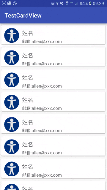
CardView称为卡片式布局,它是一个ViewGroup,被包裹的内容会以卡片式风格来进行展示。一般我们会和RecyclerView一起来使用,作为item的根布局。要在项目中使用CardView,需要先导入依赖包:
compile ‘com.android.support:cardview-v7:23.4.0’
依赖包的版本可能会有区别,是sdk版本有关。
首先我们来看一下CardView的xml布局:
<?xml version="1.0" encoding="utf-8"?>
<RelativeLayout xmlns:android="http://schemas.android.com/apk/res/android"
android:layout_width="match_parent"
android:layout_height="match_parent">
/>

<android.support.v7.widget.CardView xmlns:card_view="http://schemas.android.com/apk/res-auto"
    android:layout_width="match_parent"
    android:layout_height="match_parent"
    android:layout_margin="5dp"
    card_view:cardCornerRadius="3dp"
    card_view:cardElevation="2dp">

    <RelativeLayout
        android:layout_width="match_parent"
        android:layout_height="match_parent">

        <de.hdodenhof.circleimageview.CircleImageView
            android:id="@+id/header_iv"
            android:layout_width="50dp"
            android:layout_height="50dp"
            android:layout_marginLeft="10dp"
            android:layout_marginTop="10dp"
            android:src="@drawable/a5" />

        <TextView
            android:id="@+id/name"
            android:layout_width="wrap_content"
            android:layout_height="wrap_content"
            android:layout_marginLeft="10dp"
            android:layout_marginTop="13dp"
            android:layout_toRightOf="@+id/header_iv"
            android:text="姓名"
            android:textSize="20dp" />

        <TextView
            android:layout_width="wrap_content"
            android:layout_height="wrap_content"
            android:layout_below="@+id/name"
            android:layout_marginLeft="10dp"
            android:layout_marginTop="5dp"
            android:layout_toRightOf="@+id/header_iv"
            android:text="邮箱:allen@xxx.com"
            android:textSize="15dp" />
    </RelativeLayout>

</android.support.v7.widget.CardView>
</RelativeLayout>
本来CardView在这里应该当作根布局来使用的,可以当作根布局后,会有问题,根布局的cardView读不到,所以要再包裹一层。这种情况在item布局中比较常见。这里关于cardView常用的几个属性说明一下:
card_view:cardCornerRadius:表示设置圆角的弧度大小。layout_margin:一般会设置该值来进行隔开每个item,显示出卡片的效果。card_view:cardElevation:设置z轴的高度,让其有悬空的效果。
接下来再来看看MainActivity的布局:
<?xml version="1.0" encoding="utf-8"?>
<RelativeLayout xmlns:android="http://schemas.android.com/apk/res/android"
xmlns:tools="http://schemas.android.com/tools"
android:layout_width="match_parent"
android:layout_height="match_parent"
tools:context="com.example.mac.testcardview.MainActivity">

<android.support.v7.widget.RecyclerView
    android:id="@+id/rv_list"
    android:layout_width="match_parent"
    android:layout_height="match_parent"
    android:visibility="gone"></android.support.v7.widget.RecyclerView>
</RelativeLayout>
这里RecyclerView需要先设置隐藏,否则,如果没有数据时,点击会崩溃。
CardView例子完整源码地址
https://github.com/allen218/MaterialDesignExamples/tree/master/TestCardView
7.Toolbar
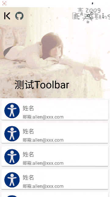
Toolbar是Android5.0之后推出的一个全新的导航控件,主要用来替换原来的ActionBar来配置CoordinatorLayout或者CollapsingToolbarLayout来实现一些联动的操作,加强用户的体验。
先来说说常规的和ActionBar相同的地方。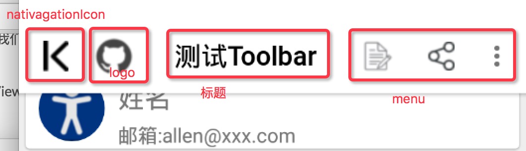
mToolbar.setLogo(R.drawable.aa12);  //设置logo
    mToolbar.setTitle("      测试Toolbar");  //这里是标题
    mToolbar.setSubtitle("github");  //这里是副标题  这个没有效果
    //这个设置需要在设置title后
    setSupportActionBar(mToolbar);
    getSupportActionBar().setDisplayShowHomeEnabled(true);
    mToolbar.setNavigationIcon(R.drawable.aa17);  //设置导航图标
    //设置menu菜单的点击事件
    mToolbar.setOnMenuItemClickListener(new Toolbar.OnMenuItemClickListener() {
        @Override
        public boolean onMenuItemClick(MenuItem menuItem) {
            String msg = "";
            switch (menuItem.getItemId()) {
                case R.id.action_edit:
                    msg += "Click edit";
                    break;
                case R.id.action_share:
                    msg += "Click share";
                    break;
                case R.id.action_settings:
                    msg += "Click setting";
                    break;
            }

            if (!msg.equals("")) {
                Toast.makeText(MainActivity.this, msg, Toast.LENGTH_SHORT).show();
            }
            return true;
        }
    });
这里我们通过onCreateOptionsMenu()方法来加载Menu图标信息。
    @Override
public boolean onCreateOptionsMenu(Menu menu) {
    getMenuInflater().inflate(R.menu.menu_main, menu);
    return true;
}
注意
使用Toolbar时,相应的Actiivty需要将theme设置为Theme.AppCompat类型的,而且需要添加windowActionBar为false,和windowNoTitle为true。具体配置见下面代码:
    <style name="AppTheme" parent="Theme.AppCompat.Light.DarkActionBar">
    <!-- Customize your theme here. -->
    <item name="colorPrimary">@android:color/white</item>  //toolbar背影颜色
    <item name="colorPrimaryDark">@android:color/white</item>  //通知栏颜色
    <item name="colorAccent">@color/colorAccent</item>  //设置像checkbox等选中后的颜色,具体看下图
    <item name="windowActionBar">false</item>  //关闭actionbar
    <item name="windowNoTitle">true</item>  //不显示标题
    <item name="android:textColorPrimary">@android:color/black</item>  //toolbar文字颜色,不包括menu菜单颜色
</style>
我们Activity设置的主题就是上面的配置。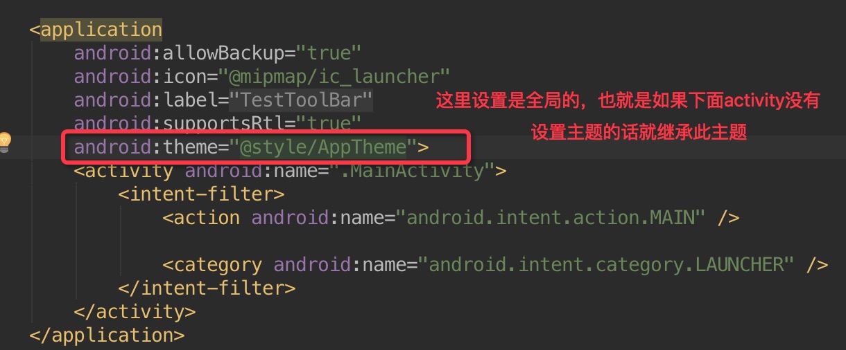 关于上面主题里相应颜色所对应的区域不是很清楚的话,可以看下图,非常清晰的说明了相应颜色的对应关系。
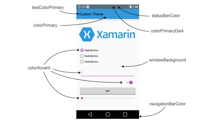
7.1 Toolbar结合CoordinatorLayout
CoordinatorLayout让我们根据滚动事件来调整子View的布局,比如在滚动内容时,隐藏toolbar.
我们主要是通过app:layout_scrollFlags=""对toolbar来设置滚动的类型,然后,通过app:layout_behavior来设置对控件的事件监听,也就是当设置了app:layout_behavior的控件,滑动时,就会触发Toolbar的滚动事件,(这里也可以不用设置app:layout_behavior,只要有滚动事件发生,就可以进行联动,但此时的页面显示可能会有问题,所以,如果需要联动和页面的显示不出现问题,需要对滑动的控件设置app:layout_behavior)但具体是什么形式的滚动,由app:layout_scrollFlags里配置的参数来决定。当然这一切一切的前提,就是需要使用CoordinatorLayout这个新的ViewGroup进行包裹。其实滚动效果的实现,也是由此Layout内部实现的。下面我们来说说几种滚动的类型吧,也就是通过app:layout_ScrollFlags配置的滚动类型。
1. scroll | enterAlways属性
实现快速返回的效果,当向上滑动时,会先滑动到隐藏Toolbar,然后再滑动其它可滑动控件;当向下滑动时,会先滑动到显示Toolbar,然后再滑动其它可滑动控件。
<?xml version="1.0" encoding="utf-8"?>
<android.support.design.widget.CoordinatorLayout xmlns:android="http://schemas.android.com/apk/res/android"
xmlns:app="http://schemas.android.com/apk/res-auto"
    android:layout_width="match_parent"
    android:layout_height="match_parent">
    <android.support.design.widget.AppBarLayout
        android:layout_width="match_parent"
        android:layout_height="wrap_content">

        <android.support.v7.widget.Toolbar
            android:id="@+id/toolbar"
            android:layout_width="match_parent"
            android:layout_height="wrap_content"
            app:layout_scrollFlags="scroll|enterAlways"></android.support.v7.widget.Toolbar>

        <android.support.design.widget.TabLayout
            android:id="@+id/tab_layout"
            android:layout_width="match_parent"
            android:layout_height="wrap_content"
            app:tabMode="fixed"></android.support.design.widget.TabLayout>
    </android.support.design.widget.AppBarLayout>

    <android.support.v4.view.ViewPager
        android:id="@+id/vp_pager"
        android:layout_width="match_parent"
        android:layout_height="match_parent"
        app:layout_behavior="@string/appbar_scrolling_view_behavior"></android.support.v4.view.ViewPager>
    </android.support.design.widget.CoordinatorLayout>
2.scroll | enterAlwaysCollapsed属性
这个和上面类似,不同的是,当向下拉时,本身控件先响应,比如RecyclerView,当本身控件滚动到顶部后,再引起Toolbar的滚动;当Toolbar显示时,此时向上拉,是先Toolbar响应,党滚动完成后,再本身控件响应。 它的布局文件和上面是一样的,只是属性改变了一下。
app:layout_scrollFlags="scroll|enterAlwaysCollapsed"
3.scroll | exitUntilCollapsed属性
这个属性默认是没有反应的,需要配合minHeight来进行使用,这里说的是我们Toolbar有一个默认高度,然后设置一个最小高度,如果默认高度大于最小高度,那么,在向上滑动隐藏toolbar的时候,Toolbar会留出最小高度部分,不作隐藏。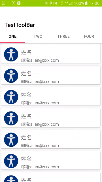 这里的布局文件与上面也基本相同,我贴出不同部分的代码:
<android.support.v7.widget.Toolbar
        android:id="@+id/toolbar"
        android:layout_width="match_parent"
        android:layout_height="80dp"
        android:minHeight="30dp"
        app:layout_scrollFlags="scroll|exitUntilCollapsed"
        app:titleMarginTop="50dp"></android.support.v7.widget.Toolbar>
7.2 Toolbar结合CollapsingoolbarLayout
当我们使用CollapsingToolbarLayout来包裹Toolbar时,layout_collapseMode属性必须设置。这两个属性是会对Toolbar来进行设置的。这个属性有两种属性值。
一个是pin,当CollapsingToolbarLayout完全收缩后,Toolbar还会保留在屏幕上。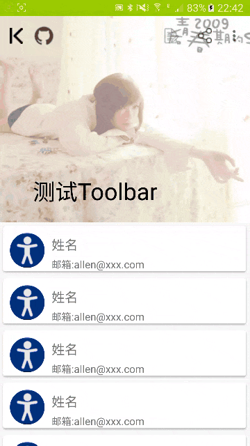
另一个是parallax,当CollpasingToolbarLayout在收缩的时候,Toolbar也跟着向上滚动,也就是Toolbar不会固定在屏幕上,而是会被隐藏。
除了给Toolbar设置app_collapseMode属性外,还需要给CollapsingToolbarLayout设置app:layout_scrollFlags属性。这个属性有三个属性值,和上面CoordinatorLayout结合Toolbar的属性是一样的。
1. scroll | enterAlways属性Toolbar会被隐藏,当向下滚动时,优化滚动Toolbar和CollapsingToolbarLayout部分。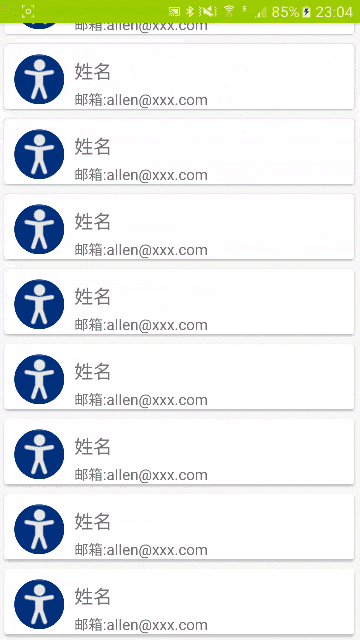
2. scroll|enterAlwaysCollapsed属性Toolbar会被隐藏,当向下滚动时,优化滚动自身控件部分,比如RecyclerView。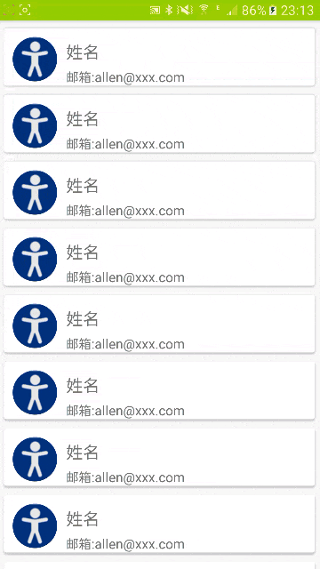
3. scroll|exitUntilCollapsed属性
这个属性设置后,向上滚动时,Toolbar部分会被隐藏,只会留下一个title部分显示在顶部,不会被隐藏。
此Toolbar部分源码地址:https://github.com/allen218/MaterialDesignExamples/tree/master/TestToolBar